
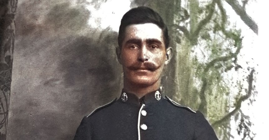
It’s a precious photo. One of the few in which my Great Grandfather William Finch appears in. He sits, hands crossed showing the sober reflection of age, whilst his son Bertrand stands ready to confront the mayhem that awaits him. Of course, Bertrand’s military tunic is something he appears to be very proud of along with the handlebar moustache. The colour red almost pops out from the monochrome tunic with your imagination playing its part. Now you choose from the drop-down menu this promised miracle… a colourised image. Just one click.

But only disappointment emerges. The military ‘coatee’ that should so clearly be scarlet red (so-called Madder red) appears as prussian blue. It’s as if the photo editing programme has caused him to change sides.

Now, as a true photo historian, genealogist or even a hobbyist you might scoff at the idea of colourising. After all, it’s not in our gift to recreate an imagined world or even hand over the responsibility to some artificial intelligence bot. Our job is to uncover facts and piece together evidence. The importance is to be authentic and not entertain flights of fancy.
But other more adventurous mortals, be they hobbyists like me or serious historians, have embraced colourising. It can knock your socks off. Figures suddenly become living breathing individuals… experiencing all the upheavals that you or I go through and much much more.
So I returned to Bertrand’s tunic. Having pressed the colourising option I still have the chance to remedy the naïve failed attempts of the programme. It’s clever enough to know that grass is green, that the sea is blue and sand is brown, but for almost everything else even artificial intelligence has no answers. Only best guesses.
If you’re embarking on colourisation of your precious photographic archive, you have to invest your own research and intuition. It’s part of the investigation process just like creating the family tree. Plenty of resources are available online to calibrate our choice of colours. Of course, no amount of research will tell you whether your Auntie Maude’s dress was a lemon yellow colour or duck egg blue. That’s probably a fact that has been lost in time. However, when it comes to choosing the correct colour for a pillar box, a uniform or a shop frontage, plenty of online resources can be used to calibrate our photochromic choices.
In order to understand colourising, a good starting point is watercolour painting. You soon come to understand that a watercolour artist thinks about two things (1) hue and (2) saturation. You control the hue of the paint on your brush by carefully selecting and mixing colours in your palette. But this will only determine the hue – somewhere on the colour wheel. The image below shows you how we can represent the full range of colours in a 360° circle.

But as historians we like to be committed to authenticity and retaining a true record of things. We know in the case of Bertrand his coatee wasn’t Prussian blue. No automated colourising program knows the hue of a black-and-white image. In the case of snow, greenery and beaches it can make an informed guess using artificial intelligence. My photo editing program (Photoshop Elements) made a pretty good job of producing a convincing scen, even identifying skin tones and the greenery that appears in the right-hand window. But any program even with the help of artificial intelligence is pretty ‘dumb’ when it comes to hue.
What the photographic restoration programme knows is what’s in the black-and-white image. It knows nothing more and nothing less. This tells the programme the ‘saturation’ of the image. In other words, if we know it’s red is it a deep red colour or light pink . When you do watercolour painting you know that by adding water you can create a full range of ‘colours’ just by varying the intensity or ‘saturation’. If we added enough water when painting the coatee we could indeed make it pink but I’m not sure that Bertrand would approve of it.

So the answer for genealogists and photographic historians is to (1) retain the original black-and-white image; (2) allow the program to make a ‘best guess’ estimate of the colourised scene and (3) make the necessary manual adjustments based on your own knowledge and research. In the case of Bertrand’s coatee it was necessary to colour check the jacket taking samples of images taken from genuine military uniforms (e.g. museum display items).
I’ve got some way with the colourising. But I still need to establish the colour of the belt and the buttons as well as the chevron on the sleeve. It’s all part of the welcome investigation process that runs parallel with all of the other exciting undertakings that genealogists gets involved in.
To summarise, there are many genealogists out there that would pooh-pooh any colourisation. For them, the only authentic image is one that is entirely intact (I assume that this includes grease marks and dust). At the other extreme, there are those that are simply on a mission to beautify the past and will use any tool to achieve this, irrespective of whether it conveys the truth or not. But between these two are those that embrace photographic restoration, but with a very critical view about any AI modifications to the original image. Having said that, they recognise that grass was also green one hundred years ago and the sky was occasionally blue – . it wasn’t a black-and-white world.
